Candle Labels vs Direct Printing: Which Fits?
A candle can smell exceptional and still read as unfinished from three feet away. That is why the choice between candle labels vs direct printing is not simply a production detail. It determines how your collection holds a shelf, photographs in a launch campaign, absorbs a seasonal update, and signals value before a customer ever lifts the lid.
For a growing fragrance brand, both approaches can be right. The stronger choice is the one that supports the product line you are building now, without working against where you intend to take it next.
Candle Labels vs Direct Printing: The Core Difference
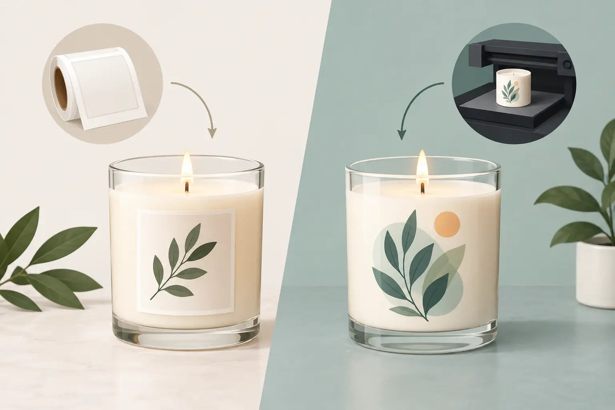
A label is a separate printed material applied to the vessel. It may be paper, textured stock, clear film, metallic material, or a durable waterproof substrate. The label carries the visual identity while the vessel remains a versatile foundation.
Direct printing places artwork directly onto the vessel, often through screen printing, pad printing, UV printing, or a related decorative process. The result is integrated: type, marks, and color become part of the object rather than an applied layer.
Neither option is automatically more premium. A well-designed uncoated label on a substantial matte vessel can feel beautifully considered. A direct print with weak artwork, poor placement, or too many colors can feel less refined than a simple label. Premium presentation comes from the relationship between vessel, finish, typography, color, and restraint.
When Candle Labels Make the Better Business Case
Labels give founders room to test, adjust, and expand. For early collections, that flexibility is often more valuable than a permanent decoration process.
Labels support small runs and fast revisions
If you are still refining fragrance names, burn instructions, safety copy, or the visual direction of your line, labels keep your options open. You can produce a short run, gather feedback, then update the next print order without being tied to a large quantity of pre-decorated vessels.
This matters when one vessel shape supports several scent stories. A cream glass may become a clean, botanical collection with soft neutral labels, then a holiday edit with rich color and foil accents. The vessel remains consistent while the label shifts the merchandising mood.
Labels also make practical changes easier. If regulations change, an ingredient statement needs correction, or a retailer requests a different barcode placement, you can revise the label rather than replace decorated inventory.
Labels create material contrast
A label adds another surface to design. That can be a strategic advantage. Consider a warm white paper label against smoked glass, a clear label that lets a saturated vessel color carry the composition, or a tactile cotton stock on a matte black jar. These contrasts create depth in hand and dimension in photography.
For candle brands building layered, editorial collections, labels offer a wider range of finishes. Embossing, foil, raised varnish, textured papers, and specialty inks are all possible depending on your print partner. The right label can make a familiar vessel feel distinctly yours.
The trade-off: application and durability
Labels require careful application. Crooked placement, bubbles, lifted corners, and inconsistent spacing can weaken an otherwise polished product. Founders should build a repeatable application process, using a placement guide or jig when volume grows.
Durability also depends on the material. Standard paper labels can scuff or absorb oil. Condensation, handling, and shipping friction may call for a more durable stock or protective finish. This is especially relevant for bathroom-adjacent products, room sprays, and diffusers, but candle labels also need to withstand a customer handling the vessel repeatedly.
When Direct Printing Earns Its Place
Direct printing is strongest when the vessel itself is meant to feel like a finished branded object. It is especially effective for clean, minimal designs with strong logo marks, restrained typography, and a focused palette.
Direct printing makes the vessel feel intentional
There is a visual quietness to ink placed directly on glass or metal. Without label edges or additional substrate, the form reads more continuously. This can be ideal for modern candle collections where the vessel color, silhouette, and printed mark do most of the work.
A single-color logo on a satin glass vessel can feel architectural. Fine white type on a deep charcoal jar can create a gallery-like effect. Direct printing is not about adding more decoration. It is about allowing less to feel more permanent.
It also creates a cohesive opportunity across formats. When a candle vessel, diffuser bottle, and room spray bottle share the same printed mark and placement, the collection gains visual authority. The packaging begins to behave like a system rather than a set of separate products.
Direct printing can strengthen perceived value
Customers may read direct printing as a more custom, established finish because it is integrated with the container. For brands positioned around permanence, ritual, or design-led home fragrance, that impression can support a higher-end product story.
The effect is particularly strong when the printing process aligns with the vessel finish. Opaque ink on frosted glass, tonal printing on a soft-touch surface, or a crisp mark on clear glass can all feel elevated. The vessel should not merely hold the candle. It should carry the brand even after the wax is gone.
The trade-off: commitment, cost, and lead time
Direct printing usually requires more planning. Minimum order quantities may be higher, setup costs are common, and lead times can be longer than ordering labels. Small artwork changes can become expensive or impractical once a run has been produced.
Color matching also deserves attention. Ink on a digital proof does not always behave the same way on amber, clear, matte, or colored glass. Fine lines, small type, and highly detailed artwork may have limitations depending on the process. Request samples or production proofs whenever possible, especially before committing to a core collection.
Direct printing is best suited to designs with longevity. If your brand identity and scent architecture are stable, it can be an investment in a stronger product presence. If every launch is still evolving, the permanence may create more pressure than value.
Choose Based on Your Collection Stage
The most useful question is not, “Which looks more premium?” Ask, “What does this collection need to do?”
A first launch with six scents, a developing identity, and limited cash flow may benefit from a refined label system. Choose a vessel shape with enough visual presence to anchor the collection, then use labels to test naming, colors, and scent families. Consistency in placement, scale, and material will make the line feel cohesive even as it evolves.
An established best-selling collection may be ready for direct printing. If the names, logo, and core palette have remained consistent through multiple restocks, printed vessels can reduce the sense that the packaging is temporary. They can also create a more recognizable brand signature in retailer photography and on a crowded market shelf.
There is also a middle path. Many brands direct-print a logo or permanent collection mark, then use a smaller label for scent-specific information, warnings, and batch details. This approach preserves the permanence of the branded vessel while retaining flexibility where it matters most. It can be especially smart for seasonal fragrance drops or rotating limited editions.
Design Considerations That Change the Outcome
The vessel finish should guide the decoration choice. Clear glass can handle a transparent or minimal label beautifully, while a saturated vessel may need an opaque ink or high-contrast label to remain legible. Matte finishes tend to reward restraint. Highly reflective glass may require testing to avoid glare obscuring fine details in photography.
Consider the label panel and the vessel’s proportions. Wide, low vessels often benefit from a horizontal composition with generous margins. Tall vessels can support stacked typography or a vertical mark. Direct printing has the same spatial discipline: artwork should follow the object’s form, not fight it.
Finally, think past the unboxing moment. A candle vessel often remains in a home as a catchall, planter, or decorative object. Direct printing can turn that afterlife into an ongoing brand impression. A beautiful label can do the same, particularly when it feels intentional enough to leave in place. The standard is simple: would someone want to keep this object visible once the candle is finished?
Build for the Brand You Want to Become
Labels are not a compromise, and direct printing is not a shortcut to luxury. Each is a design and operations decision with a different kind of power. Labels offer movement, experimentation, and texture. Direct printing offers permanence, integration, and a more custom vessel story.
Choose the finish that gives your collection room to look complete now and grow with conviction later. When every component is considered - vessel, closure, label or print, carton, and fragrance name - customers do not see a container. They see a brand worth bringing home.