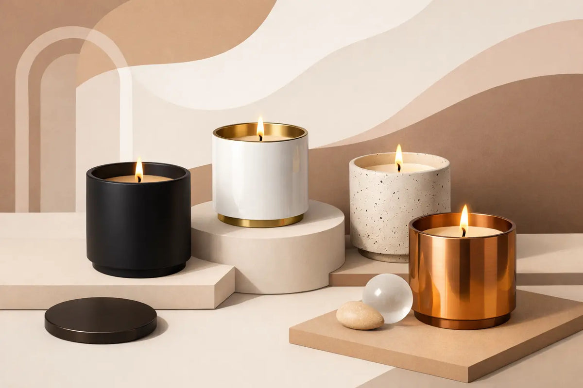
Premium Candle Vessel Finishes That Define a Brand
A customer can make a decision about your candle before they read the scent name, lift the lid, or experience the cold throw. Premium candle vessel finishes set that decision in motion. The surface catches light, the color establishes mood, and the weight in the hand signals whether the product belongs on a bedside table, a gift shelf, or the center of a carefully styled room.
For a fragrance founder, finish is not a decorative afterthought. It is part of the product's positioning. A vessel in soft matte cream speaks differently than high-gloss black glass. Warm amber makes a candle feel apothecary-inspired and grounded; a translucent smoke glass can feel architectural, restrained, and modern. The wax may be the product inside, but the vessel is often what makes a customer stop scrolling.
Why Premium Candle Vessel Finishes Matter
A finish gives a form its point of view. Two jars with a similar silhouette can occupy entirely different places in the market when one is frosted and one is clear, or when one is metallic and one is ceramic-inspired. That difference shapes perceived value, gifting potential, photography, and the kinds of scents that feel credible within the collection.
This is especially relevant in a crowded handmade market. A beautiful scent description can earn attention, but cohesive presentation earns recognition. When a customer sees the same finish language repeated across candles, diffusers, room sprays, and packaging, the line begins to feel established rather than assembled.
Finish also affects practical customer experience. Some surfaces conceal fingerprints better than others. Certain metallic treatments need more careful handling during fulfillment. Darker glass may help protect light-sensitive fragrance materials in adjacent diffuser formats, while clear vessels make wax color and decorative details more visible. There is no universally superior option. The right one depends on what your brand needs the product to communicate and how the customer will use it.
The Main Types of Premium Candle Vessel Finishes
Matte and soft-touch finishes
Matte vessels are quiet, tactile, and distinctly contemporary. They work well for brands built around calm, minimalism, natural materials, or elevated everyday rituals. A matte white vessel can create a gallery-like canvas for restrained typography, while matte olive, clay, or charcoal introduces depth without demanding visual noise.
Their strength is subtlety. Matte finishes diffuse light rather than reflecting it, which can make labels feel more integrated and editorial in product photography. The trade-off is that pale matte surfaces may show scuffs or oil marks more readily during production and shipping. If your line will be handled frequently at markets or stocked in busy retail settings, sample the finish under real conditions before committing.
Gloss and lacquered finishes
A polished, glossy vessel has a sharper presence. It reflects light, reads as more formal, and can make saturated colors feel especially rich. Deep navy, oxblood, emerald, or black gloss can create an immediate sense of occasion, making this finish a strong candidate for holiday launches, evening-focused scent collections, or statement gifting.
Gloss also has a useful clarity in visual merchandising. It pairs naturally with foil labels, clean white type, and polished lids. But it is less forgiving of fingerprints and surface scratches than a matte counterpart. For a high-touch retail product, consider whether your fulfillment process and retail environment can preserve that pristine finish.
Frosted and etched glass finishes
Frosted glass creates softness without hiding the vessel's underlying material. It is especially effective for candles designed around clean fragrance profiles, pale waxes, spa-adjacent rituals, and light-filled imagery. A frosted finish turns a lit candle into a diffuse glow rather than a clear view of flame and wax, adding atmosphere even before the scent enters the room.
This finish can also bridge modern and classic design. It feels refined beside a minimalist label, yet it can support botanical or apothecary-inspired branding when paired with the right color and typography. Frosting is not automatically delicate, however. Its final impression depends on opacity, vessel shape, lid choice, and palette.
Metallic finishes
Metallic candle vessels bring instant punctuation to a collection. Brushed gold, soft champagne, antique brass, silver, and gunmetal can signal celebration, luxury, or a more dramatic interior point of view. They are compelling for limited editions because they make a release feel visibly distinct without requiring a new vessel form.
Use metallics with restraint. A full line of reflective finishes can feel seasonal or overly ornate if your core identity is understated. Often, metallic works best as a selective layer: a winter release, a milestone scent, or a gifting-focused capsule that sits alongside a more permanent matte or glass collection. Test labels carefully, too. High-shine surfaces can compete with intricate artwork, while a simple mark or tonal label can feel more resolved.
Translucent and colored glass finishes
Colored glass offers one of the clearest ways to build a recognizable visual system. Amber, olive, cobalt, smoke, blush, and deep green each carry their own emotional register. The right palette can make varied fragrance families look connected on a shelf, even when their labels and scent stories differ.
Translucency creates another choice. More transparent glass shows wax level and flame clearly, making the candle feel open and familiar. More opaque color feels moodier and more sculptural. Consider the setting in which your customer will encounter the product. A clear or lightly tinted vessel can excel in airy lifestyle photography. A smoky or richly colored vessel may create stronger contrast in a darker, more design-led visual world.
Choose the Finish After You Define the Collection
The fastest way to make a vessel decision feel arbitrary is to select a color because it is attractive in isolation. Instead, begin with the collection's role. Is this your permanent signature line, a seasonal edit, a luxury tier, or a giftable entry point? The answer should influence both the finish and the investment you make around it.
A permanent collection benefits from finishes with longevity. Neutral mattes, warm amber, clear glass, smoke, and softly tinted colors tend to give a line room to evolve through labels, fragrances, and campaigns. Trend-driven shades can be powerful, but they often work better as a limited color story than as the foundation of your entire brand.
Then consider scent architecture. A mineral, coastal collection may suit frosted white, sea glass tones, or muted gray. Resinous woods and smoked vanilla may feel more natural in amber, black, deep olive, or brushed metal. The goal is not to illustrate every scent literally. It is to create a visual climate that makes the fragrance promise believable.
At Dream Vessels, collection thinking matters because founders rarely stop at one product format. A vessel finish should leave space for coordinating diffuser bottles, packaging, lids, and accessories, so the customer experiences a brand system rather than a series of isolated purchases.
Pair the Finish With the Right Supporting Details
A premium finish is only one part of the composition. The lid, label material, wick presentation, and outer packaging either reinforce it or dilute it. A matte vessel with a glossy plastic lid may create visual friction. A richly colored glass jar paired with a weak, undersized label can lose its presence. Design decisions need to speak to one another.
Start with contrast. On a dark or metallic vessel, an uncoated paper label or light ink can provide tactile balance. On a pale frosted finish, black typography and a darker lid may add the structure the product needs. If the vessel itself is visually active, keep the label simpler. If the vessel is quiet, the label can carry more of the story.
Scale deserves equal attention. A wide vessel with a small label can look unfinished unless that negative space is intentional. Conversely, wrapping a refined vessel in too much copy can erase the quality you paid to source. Create a physical mockup before printing in volume. Photograph it in daylight, place it on a shelf beside competing objects, and view it from the distance a customer would use while browsing.
Test Finish in the Real World, Not Just on a Screen
Product imagery is essential, but screens flatten material. Order samples and test them with your intended wax, wick, label adhesive, lid, and shipping materials. Set the vessel near a window, under warm indoor lighting, and in the lighting you use for photography. A finish that feels perfect in a supplier image may read cooler, shinier, or darker in your own environment.
Look beyond aesthetics during testing. Check whether label edges lift, whether surfaces show handling marks, whether the lid fits the visual weight of the jar, and whether the finished candle feels balanced in the hand. If you sell at markets, bring samples to your display. Watch what people pick up first. The finish is doing its job when it invites touch and supports the price point without needing an explanation.
The most memorable candle brands do not treat a vessel as a container waiting to be labeled. They treat it as the first expression of the product. Choose a finish that can hold your scent story, your imagery, and your ambitions - then give it enough consistency to become recognizable long after the candle has burned.