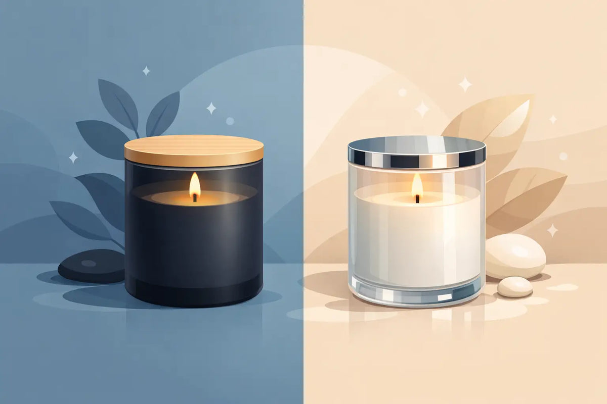
Matte vs Glossy Candle Jars for Your Brand
A candle jar is often the first part of the product a customer experiences. Before the fragrance throws, before the wick is lit, the finish sets an expectation. In the decision between matte vs glossy candle jars, the right answer is less about personal preference and more about the world your brand is building.
A matte vessel can make a fragrance feel quiet, architectural, and deliberately edited. A glossy vessel can bring light, color, and a more immediate sense of polish. Both can look premium. The distinction is in what each finish asks the customer to notice - and how that choice carries across your labels, cartons, photography, and wider home fragrance collection.
Matte vs Glossy Candle Jars: The Visual Difference
Matte and glossy finishes handle light in fundamentally different ways. Matte surfaces diffuse it. Rather than creating bright reflections, they hold color with a soft, velvety presence. Glossy surfaces reflect light more directly, giving the vessel a cleaner sheen and a sharper visual edge.
That difference changes the perceived personality of the candle. A warm taupe, muted olive, charcoal, or ivory jar often gains depth in matte. The finish makes a restrained palette feel tactile and intentional, especially when paired with minimal typography, uncoated cartons, or tonal labels. It supports a brand language that feels collected rather than decorated.
Glossy finishes tend to make color appear clearer and more energized. A deep black jar becomes lacquer-like. White feels crisp. Jewel tones and saturated seasonal colors can feel especially expressive under a reflective finish. For a brand with a bright, playful, glamorous, or contemporary point of view, gloss can create the visual punctuation a collection needs.
Neither finish is inherently more luxurious. Matte suggests luxury through restraint. Gloss suggests luxury through refinement and light. The strongest choice is the one that makes sense before a customer reads a word on the label.
Choose Matte When Restraint Is Part of the Brand
Matte candle jars are a natural fit for founders creating a composed, modern visual identity. They photograph beautifully in soft daylight, sit comfortably within neutral interiors, and offer an understated backdrop for a label or direct-print design.
A matte vessel is particularly effective when the fragrance is positioned as part of a ritual: an evening wind-down, a slow Sunday, a considered hosting moment. The surface has a quietness that allows naming, scent stories, and tonal color choices to carry more weight.
It also works well when you are building a collection rather than releasing individual scents without a visual system. A family of matte vessels in related neutrals can look highly cohesive on a shelf, even when each scent has its own color or label detail. This is valuable for founders planning discovery sets, seasonal drops, or coordinated candle and diffuser formats.
There are practical considerations. Matte-coated surfaces can show oil marks, scuffs, and handling more visibly than certain glossy finishes, particularly on very dark colors. They should be packed, stored, and merchandised with care. If your candles will spend significant time on busy retail shelves or move through high-touch markets, test samples under real handling conditions before committing to a full line.
Matte also asks for discipline in label design. A highly reflective metallic label, an overly busy pattern, or multiple competing finishes can interrupt the calm that drew you to matte in the first place. Let the vessel do its work, then add contrast with intention.
Best matte pairings
Matte jars are especially compelling with textured paper labels, soft-touch boxes, blind embossing, restrained foil details, natural wood or neutral metal lids, and a pared-back palette. Think of the full composition, not just the vessel in isolation.
Choose Glossy When You Want Presence and Light
Glossy candle jars are made for a different kind of shelf moment. Their reflective surface catches ambient light, creating an immediate, polished impression. In a retail environment, that can help the product feel more visible from a distance, particularly alongside matte paper packaging or darker displays.
For brands with elevated color stories, gloss can make the palette feel more intentional rather than merely decorative. A gloss forest green can feel rich and heritage-inspired. A high-shine cream can read as clean and modern. A glossy black vessel can move from classic to dramatic depending on the label system around it.
Gloss is also useful when a line needs a more accessible, giftable personality. It can feel celebratory without becoming overly ornate. Consider it for holiday collections, colorful limited editions, bold scent families, or a signature candle designed to stand apart from a quieter core range.
The trade-off is reflection. Glossy surfaces can create glare in product photography, especially under direct lighting. Fingerprints may also be more noticeable on darker glossy colors. These are manageable details, but they should influence how you plan your content production, packing process, and in-person presentation.
A glossy jar gives labels a more active visual backdrop. High-contrast graphics, clear white typography, and crisp shapes often work well. Yet the finish already provides energy, so the design still benefits from restraint. A polished vessel does not need every other component to compete for attention.
Best glossy pairings
Glossy vessels work beautifully with bright white labels, clean typography, metallic accents used sparingly, high-contrast cartons, and polished lid finishes. They can also create a compelling counterpoint to tactile materials such as ribbed paper, natural cotton ribbon, or molded pulp packaging.
Think Beyond the Individual Candle
The most commercially useful question is not, “Which jar do I like more?” It is, “Which finish helps my full assortment look unmistakably mine?”
A single matte jar may look beautiful on a worktable. But if your diffuser bottles, room sprays, wax melts, and gift boxes lean bright and glossy, it may feel disconnected at launch. Likewise, a glossy candle can be striking on its own but visually loud when every product in the range uses reflective surfaces and saturated color.
Consider the finish as part of a visual hierarchy. Your core collection might use matte jars to establish a permanent, grounded foundation. Glossy vessels could then frame seasonal releases, holiday editions, or fragrances with a more vibrant character. The contrast becomes a merchandising tool rather than an inconsistency.
You can also reverse that system. A glossy signature collection may establish a recognizable house look, while a matte limited series signals a more intimate or design-led release. What matters is that customers can understand the relationship between the pieces at a glance.
For brands working across several fragrance formats, aligned form matters as much as aligned finish. Similar silhouettes, lid tones, label proportions, and color families create continuity even when a candle jar and diffuser bottle are not exact matches. Dream Vessels approaches vessels as parts of a collection because customers do not experience your products one SKU at a time. They experience the shelf, the gift set, and the unboxing as one brand statement.
Test the Finish in the Conditions That Matter
A finish decision should not happen only on a screen or from a single styled photo. Order samples and place them where your customers will see them: near a window, under warm indoor lighting, on a market table, and against the materials you plan to use for packaging.
Fill a sample with your intended wax. Add the actual wick, lid, label, and warning label. Photograph it beside the rest of the collection. Then ask a more useful set of questions: Does the color still feel right under warm light? Does the label have enough contrast? Does the jar look premium from three feet away? Does it still look considered after repeated handling?
Burn testing remains essential whenever you introduce a new vessel or make a material change. A finish is primarily an aesthetic choice, but the complete candle system still needs to perform as intended. Test with your wax, fragrance load, wick series, fill weight, and production process rather than relying on a previous test from a different jar.
Pay attention to operations, too. If your label application is done by hand, a jar with strong reflections may make placement errors more apparent. If you offer personalization or frequent small-batch launches, a matte surface may give your changing label designs a more flexible stage. The best design choice is one your team can execute consistently.
Let the Fragrance Positioning Lead
There is no universal winner in matte vs glossy candle jars. A moody cedar and smoke candle may feel most credible in a soft black matte vessel, but it could be equally compelling in polished black glass for a more formal, evening-oriented brand. A citrus fragrance might come alive in gloss, while a subdued matte yellow could make it feel more editorial and unexpected.
Start with the feeling you want to own. If your brand is calm, textural, quiet, and architectural, matte gives that perspective a strong physical form. If it is luminous, expressive, crisp, or celebratory, gloss may carry the message more clearly.
The finish is not a final decorative layer. It is part of the product's point of view. Choose the one that gives your fragrance line a recognizable presence long before the candle is lit.